We recently got our hands on an iPhone 14 Pro and were excited to check out the Dynamic Island feature. This article will discuss how it works and whether the feature is worth all the hype it receives. We shall cover the basics first.
What is Dynamic Island?
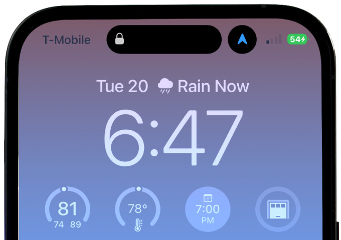
Dynamic Island refers to the pill-shaped cutout that you can see on the top portion of the iPhone 14 Pro and Pro Max. This cutout is designed to replace the notch that iPhone devices had for a few years. By the way, it also needs to be noted that you can see the old notch on iPhone 14 and 14 Plus. Like the notch, the Dynamic Island portion houses a few things, such as the TrueDepth camera and FaceID systems. But Apple has added a few more pixels to the cutout portion, allowing the area to expand and contract. And when it expands, the area creates a larger space you can use to interact with your iPhone. We believe you can guess the reason behind the name now. It is called an Island because it looks like one, surrounded by the large display of the iPhone. It is called Dynamic because it can change its shape and size.
How Does Dynamic Island Work?
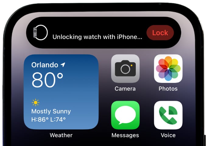
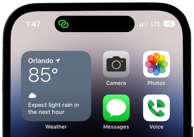
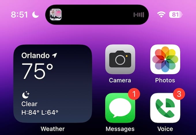
As we said, Dynamic Island is designed not just to replace notch. On the contrary, it introduces a new space. Dynamic Island on iPhone 14 Pro and Pro Max can accommodate notifications and real-time data from some applications/functions. We think you can understand this better through some examples. When you receive a call on your iPhone 14 Pro or Pro Max, the Dynamic Island cutout will become larger to show you a giant notification pill. As you can see in the image below, you can see a bigger Dynamic Island. It is worth noting that the cutout does not really expand, though. Instead, Dynamic Island creates an illusion of being expanded by turning the surrounding pixels to black. On the other hand, when you record a voice memo, you can see the real-time notification on Dynamic Island. As you see in the screenshot below, Dynamic Island expands on the left and right sides to accommodate the voice memo icon and the timer. In the same way, Dynamic Island can change based on the app you are running. Here is a quick list of the info you can see on the Dynamic Island portion.
When you unlock your iPhone using FaceIDWhen you plug in your iPhone to charge itWhen you receive an AirDrop connectionWhen you connect a pair of AirPodsActive timers on your iPhoneStatus of the personal hotspot connectionPrivacy indicators for camera and microphoneTurn-by-turn navigation from Apple MapsPlease note that it is a limited list
But Dynamic Island is not just about showing information. You can use the space to interact with your iPhone and apps.
How Do I Interact with Dynamic Island on iPhone?
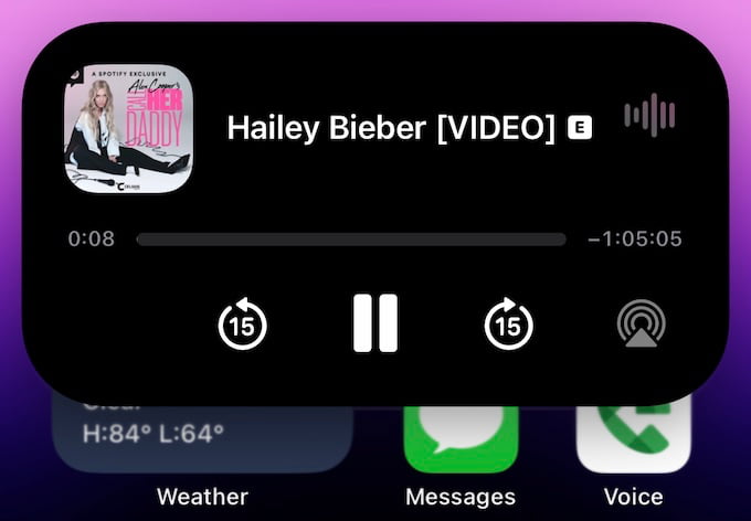
There are several ways to interact with Dynamic Island on your iPhone. But it depends on the app, which shows the information on the Dynamic Island portion in the first place. For instance, if you receive a notification on Dynamic Island, you can tap on the notification to open the app in question. However, in some cases, you can hold the notification to expand the Dynamic Island space. For example, you can do it if you have music playing on the device. Holding the Dynamic Island portion will launch a mini music player UI on the top part of your iPhone display. You can use Dynamic Island to multitask better with your iPhone. For instance, the Dynamic Island pill space can split into a circle and a smaller pill when you get two notifications. However, there is no way to change the position of the apps.
Can you Control/Change Dynamic Activities?
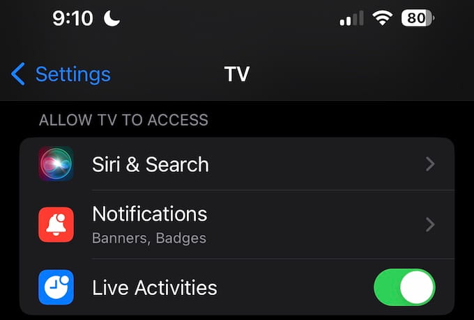
Surprisingly, there is one place where you can control Dynamic Island. If you own an Apple TV, you can turn that Dynamic Island off on your iPhone Settings > TV Screen, listed as “Live Activities” under Allow TV Access. As you can expect, Apple has done a great job optimizing these transitions.
Dynamic Island: The Good, the Bad, and the Ugly
Now that we have seen the core functionalities of Dynamic Island on iPhone 14 Pro and Pro Max, here come our insights on this feature. The Good: Dynamic Island works so well in integrating with the iPhone experience. As we said, it is powered by smooth animations and transitions from Apple. So, it will be a smooth journey when you want to launch an app or tap on a notification for expansion. The Bad: As you can guess, customizability is not the biggest forte of Dynamic Island. You do not have much control over how the feature works. For instance, you cannot turn off Dynamic Island or decide which apps can show information there. The Ugly: We still do not know how much control third-party apps can have regarding Dynamic Island. Therefore, only time will tell whether the Dynamic Island space becomes something of actual use in the grand scheme.
Is It Worth the Hype?
Apple has clearly done a good job with Dynamic Island, but it remains restricted by its exclusive nature. True, the expandable space called Dynamic Island can be incredibly useful, but it all depends on the amount of control Apple gives developers. On the bright side, many apps like WhatsApp and Google Voice are working to include support for Dynamic Island. And we hope to see some significant changes in the coming months. Notify me of follow-up comments by email. Notify me of new posts by email.
Δ


